Informed Comment Homepage

Thoughts on the Middle East, History and Religion

Header Right

Donate

  • Facebook
  • Twitter
  • Google+
  • Email
  • RSS
  • Featured
  • US politics
  • Middle East
  • Environment
  • US Foreign Policy
  • Energy
  • Economy
  • Politics
  • About
  • Archives
  • Submissions

© 2023 Informed Comment

  • Skip to content
  • Skip to primary sidebar
US politics

Immigration and the Future of America (Chart)

Juan Cole 01/29/2013

Tweet
Share
Reddit
Email
0 Shares

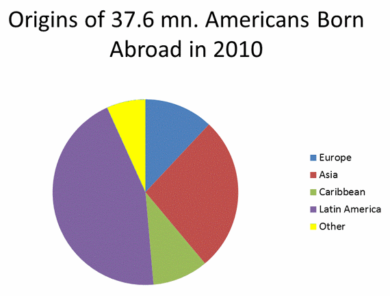
Immigration to the US is if anything accelerating. The 1924-1965 immigration law had been racist and set strict quotas for everyone but northern Europeans. Since 1965, up to 25,000 immigrants can come from each country in the world. Increasingly, immigrants come not from Europe but from Latin America & the Caribbean, from Asia, and from Africa. Immigrants and their children will by 2050 increasingly account for most new Americans. This chart is what the United State will more and more look like in the coming decades– heavily Latino, Caribbean and Asian and African (about 1.5 million of the “other” category is Africans).

Since Latinos and Asians overwhelmingly voted for President Obama, this diagram also charts the decline of the Republican Party if it doesn’t stop being the party mainly of angry white men.

Originsimm

Filed Under: US politics

About the Author

Juan Cole is the founder and chief editor of Informed Comment. He is Richard P. Mitchell Professor of History at the University of Michigan He is author of, among many other books, Muhammad: Prophet of Peace amid the Clash of Empires and The Rubaiyat of Omar Khayyam. Follow him on Twitter at @jricole or the Informed Comment Facebook Page

Primary Sidebar

STAY INFORMED

Join our newsletter and have sharp analysis delivered to your inbox every day.

Twitter

Follow Juan Cole @jricole or Informed Comment @infcomment on Twitter

Facebook


Sign up for our newsletter

Informed Comment © 2023 All Rights Reserved

Posting....